f

Tuesday, October 9, 2012

fall feels.

this afternoon it is gray and sprinkling out. i want to throw my hair up, jump into a super soft warm sweater, sip a french coffee at my favorite cafe and be surrounded by fall feels.
(via)
just saying...enjoy!


fall is for fire.

fall is for fire. i mean, let's face it...who isn't drawn to a good fire? winter is for fire too, but the autumn is our first chance at it after a long beautiful warm summer.

i've noticed as i've driven around my area already this fall, especially happening by commercial spaces savouring their outdoor patios just as long as they can, that there are certainly some very cool options for outdoor fireplaces. these from planika have my attention today. why? just because they're different. that's why...
i love that a coffee table is transformed into an indoor/outdoor spectacle. a place to gather, in a primeval sort of way, around the fire, mesmerized and captivated. relaxed and rejuvenated. fire does that. i don't know if any of us know why, but it does.

i hope that your tuesday is starting off in a productive and positive way. i have beaucoup amounts of work to do today for my graduate courses. so i'm planted right here for a while, my view the computer screen. i'll get out for a run or something though, every now and then, must. step. away. from. the. computer. ;) enjoy!

Monday, October 8, 2012

polychromatic crossing.

here we go with post #2 today and just how color & pattern can change, and how they can change how you experience design or a particular element/piece within design. this crossing table, designed by patricia urquiola and offered up by glas italia is made from thick tempered glass and is dynamic. and here's why...
the crossing table "presents a magical pattern of weaving and overlapping lines & colors." through an intriguing laminating process, three dimensional polychromatic decorative line is incorporated into the glass, offering the impression of an ever changing, ever interesting experience as you move around the piece. the result is a beautiful graphic effect, oh, and a beautiful piece of design for your spaces ;)

how is your monday humming along? i'm on my way to bring my son back to college. i don't mind the 2 hour drive each way because in the car, alone, we talk, we laugh, and we listen to music we've both been dying to share with each other. so, like i said, i don't mind the drive...enjoy!

low-culture designs.

happy monday friends! i wanted to share with you today 2 posts that consider how color changes as we move around a particular design. the first post today features nightshop, a design team made up of ward van germet & adriaan van der ploeg, based in rotterdam who reference everyday life "and a strong focus on bringing aspects of low-culture into their designs."
these p.o.v vases, which stand for point of view offer just that...a different array of colors, a different view and dynamic as you walk around each piece. made from different types/colors of plastic (yes plastic!), nightshop states that these p.o.v. vases and the unique experience they offer are "quite magical to us." so there you have it, a little magic for you this monday morning! color/pattern changing post #2 coming this afternoon...enjoy!

Friday, October 5, 2012

friday/interior eye~candy/tumblr love.

happy friday friends! i have been stumbling over some eye~candy~worthy interiors lately but many are from the fab tumblr site, undecorate (plus i love their book!). i thought we'd just go easy on the eyes this friday...
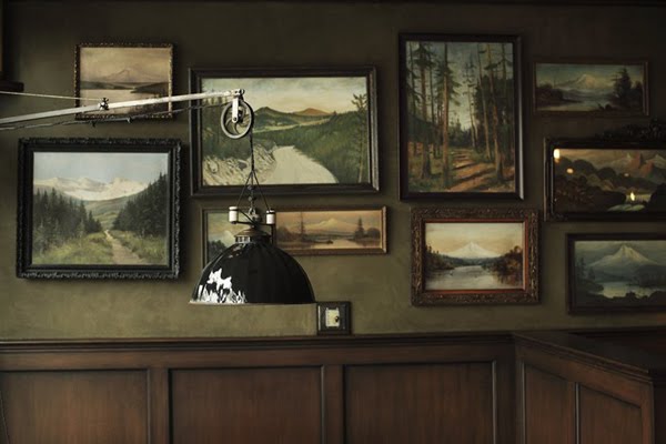
apparently i also have a fixation on art walls today as many of my favorites feature unbelievable art walls. and how about that oxblood leather couch in the top image? so..................yeah, i want that ;)

what are you up to this weekend? my son is coming home again from college, he was going camping but his plans fell through so i get the pleasure of his company which i'll take! so i'll be feeding him again and laughing at his fabulous dry sense of humor. so, a perfect weekend then. enjoy!

Thursday, October 4, 2012

symmetry space.

this afternoon, i'm drawn to the equilibrium, the symmetry that this space offers. sometimes you just need it...
(via)
there's a lovely balance, a harmony and comfortable~ness to this space. yet i really like how it's not quite perfect symmetry with the mismatched pillow patterns. fun! enjoy...

topps tiles. tiles for everyone.

i wanted to share with you today a perfect choice for natural stone tile options, topps tiles. ancient civilizations utilized stone tiles for their interiors, whether it be for floors or wall treatments, and they created stunning interiors because of it.

so why can't we do the same thing today? if you are considering starting or are in the process of transforming your residential or commercial space, remember that you have choices out there, of materials & mediums, such as natural stone tile, such as topps tiles.
i don't know about you, but when i'm transforming a space, or entertaining the idea at its earliest stages, i'm constantly reviewing material options. these topps tiles stone tiles are a creative and interesting approach to the building of your floors or walls. why not design differently, why not utilize natural stone tiles? see, you can't even think of a reason not to...can you? enjoy!

(this post is sponsored by topps tiles)

Wednesday, October 3, 2012

liking this simplicity. all of it.

this entry way is so simply done that it's just about perfect. from the door mat to the simple pot and plant. all of it. it's just beautiful.
(via)
just some afternoon entry way inspiration for ya! enjoy...

utilizing stone tiles, naturally.

whether you are remodeling your home or commercial space or perhaps building a new space, utilizing an array of materials or mediums only makes for interesting spaces.

materials such as stone tile provide texture, they provide a little bit of glamour and richness by offering unique options that make for seriously beautiful spaces! the tile depot offers up a HUGE variety of stone tiles with options such as cappuccino polished, brazilian multicolor and carrara white polished, your head will be swimming wondering which stone tile to settle on...here are some of my favorites, have a look!

and it gets even better...besides offering a giant inventory of choices for stone tile, the tile depot offers you a price promise and take home options. they will not be "beaten on price" and they allow you to take home a tile of your choice to make sure it looks just as great in your own home or commercial space, as it does in their showroom.

so....how can you go wrong? no, seriously, how can you? check out the tile depot. if you're in the market for stone tile, you'll find what you are looking for. enjoy!

(this post was sponsored by the tile depot)

Tuesday, October 2, 2012

just stunning. every inch.

i stumbled upon this facade via remain simple. and i have to say, i love every inch. from the mixture of materials used, to the use of differing period styles, to the layout & design of it all. well, my jaw dropped.
i think from surfing around that it's part of a museum in brazil? not 100% sure. but at any rate, it should be part of my home, in massachusetts. or anywhere that i live. just saying...enjoy!

paul wright. a painterly language.

i wanted to feature the paintings of paul wright today. paul notes that he's "developed a painterly language" evolving, from illustrating...toward painting. paul's subjects are "glimpsed at rather than exposed." their "inner selves hinted at but ultimately inscrutable."
oh and the space that paul places his subjects of study are ambiguous on purpose. "the spaces they inhabit are often indeterminate, providing an atmosphere that allows for ambiguity of psychological state." "the subjects retain their integrity and yet a sense of intimacy is evoked."

paul wright also paints things, interiors, flowers etc. but his studies of people are what i found myself drawn to. his unconventional approach to recognizing people, through imposing thick brush strokes, a confidence to his application of the paint and the fact that he places them head on, direct and allowing you to experience them right away and intensely. this is what artwork is all about. enjoy!

Monday, October 1, 2012

skinny hallway direction.

this tokyo home, featured on dezeen, also happens to have these...amazing hallways.
i love that you don't know where they'll lead to or what is in store for you at the end. so fun!

how is your mid~day monday treating you? i'd love to hear...enjoy!

myyour. & hey for monday!

happy monday friends! i thought these were fun for a fresh new week's start, these stools & tables offered up by myyour.
myyour's stools/tables are the perfect mixing of "empty and full space," where the voids offers just as much interest and design as the space that exists. plus i really like the play between all of that white and the peaks of underlying vibrant color.

in a residential setting, one or two would do. commercially, these myyour stools and tables create a very textural setting, especially when paired with the same style but in the form of lighting. you can see myyour's lighting line here. in the end you'd have yourself a virtual artistic installation. and that my friends is cool. enjoy!