f
Showing posts with label color palettes.. Show all posts

Wednesday, September 10, 2014

this space. this RUG!

i don't even know where to begin with the love for this space...
(via)
the light, the white...and that rug! enjoy...

Thursday, February 27, 2014

an apartment tour, oh & that i love...

did you guys catch the recent home tour of kate arend's home, from wit & delight? yowzers!
it's not often i feature and entire home tour. there are homes where i really love one room or the other, but not always the entire home. this is a home where not only do i love every room, i love every inch of every room.

kate and her husband live in minneapolis and kate wears many creative hats. you can see more of their home here and also read a great interview she gave there too. oh just some crazy beautiful interior eye candy to start your almost friday. enjoy!

Wednesday, November 13, 2013

ancient to modern, in salento italy.

when this italian architect/designer couple were searching for a vacation home, away from their hectic home base of milan italy, they headed southeast, to salento, which some call the high heel in italy's boot...
at one time a 17th century oil mill, complete with original stone floors, walls and those amazing arches, the architect couple of ludovica serafini and roberto palombo knew the lines were there, and what they could do with them...

all of the washed out whites, the natural color palette introductions to each and every space leaves this modern vacation home sunny, warm and welcoming. another really great aspect of this article, which was featured on dwell, here, is that as designers, the couple also designed much of the furniture and you can read about each piece or where to find them for yourselves.

i LOVE this space. it is where i'll place my self today, imaginatively, as i day dream among freezing cold temperatures and a coating of snow on the ground. enjoy!

Thursday, August 15, 2013

cloud furniture.

brazilian architect and designer humberto da mata has designed, among other pieces, this "cloud" collection of furniture, made of striped cotton all situated atop colorful metal bases...super fun.
i love how all together he's managed to offer a sculptural quality to each piece, right there with color and texture. he's mixed materials, one of my favorite things a designer can do and all the while the pieces are also convenient, they are utilitarian. but hey, who says utilitarian can't be fun. at the same time. enjoy...


Tuesday, March 19, 2013

beklina. between black & color.

truth be told, i buy & wear waaaaayyy more black than i should. but it's so terribly classic and perfect that i can't help myself. beklina has me pulled between black & color. as spring approaches. as summer approaches. as their product line is just so divine. what's happening here is beklina is showing me that i can have the best of both worlds. and i like it...
beklina's site offers up a ton of stuff that i could, would include in my spring wardrobe if i could buy all of it. i've settled on these few favorites to share with you. (including those fabulous lemon yellow muun baskets for your kitchen table, coffee table, nightstand, you name it.)

what things, color palettes are you craving as we ease out of winter and as spring is upon us? i'd love to hear! enjoy...

Tuesday, March 12, 2013

take a line for a walk. moroso.

ok, so we all know moroso. the name. the line. the fact that moroso houses some of the most talented designers and creates some of the most cutting edge product line for residential or commercial choices and impact. but as of late, this "take a line for a walk" lounge chair, designed by alfredo haberli and offered up by moroso has me considering a multitude of possibilities...
they vary in color palette, materials and beckon you to cocoon yourself, to wrap up and shut the rest of the world out. to just be. to be in the moment. any moment. moroso describes the experience of these chairs as an "archaic yet extremely modern visual force."

if you are in search of "protection" and by that i mean just escaping from everyone and everything for even just a little while, plant yourself down in one of these. i think they would be my go~to space. seriously, they would, like all of the time. enjoy!

Wednesday, March 6, 2013

flexi lights by faro.

these are fun this mid~week afternoon. these "flexi" lights offered up by the spanish company, faro.
the fact that these lights can be manipulated, directed & shaped makes them fun. the fact that they come in materials such as polycarbonate, acrylic and steel and colors like fuchsia, makes them even more fun.

how is your wednesday afternoon friends? i'm trying to muster energy after a late class last night in boston. it's also grey and raining today in my part of the world so another reason for my sluggish mood. even though i'm tired, i'm thinking a run might do the trick and give me a boost. i hope you are feeling energetic and inspired today...enjoy!

Friday, January 4, 2013

rough cuts.

happy friday friends! today i wanted to share how much i really like the rough cuts, the not so perfect nature of these pieces offered up by alexis russell on her etsy site lexluxe.
the mixture of the shiny gold and the silver white of the rough diamonds make for a interesting surprise. and who doesn't want to be interesting? enjoy!

Tuesday, November 27, 2012

hard goods.

rooted in clean lines and planted in mid-century classic modernism, this inclinare bench offered up by hard goods is thin, strong and cast from concrete...and all propped up by a caterpillar yellow steel rod frame. oh and the frame? it comes with a very cool assortment of powder coating color palettes. but the yellow, it steals my attention, and my heart.
and just when you think concrete is uncomfortable, think again. i've plunked myself all around my campus at harvard and throughout boston. concrete is surprisingly cool & comfy, offering perfection in an imperfect medium.

hard good's motto is that "life is too short to make ugly things." and so they didn't. enjoy!


Tuesday, April 10, 2012

brave walls. going for pattern & color.

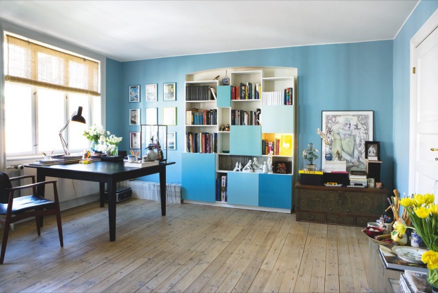
are you daring? in any way shape or form? i'm somewhere in the middle and lean to the more daring side, than away from it. color doesn't scare me. and you know what? it's just color, you can change it anytime you'd like. on that note, i just love what mikkel kure has done with his apartment, featured on bolig magasinet. and the use of all that blue? calm, cool & collected is what i say about that.


doesn't this space, from one blue toned room to another, somehow draw you in, sort of like diving into some sort of serenity pool? it does that for me, and i love it!

happy tuesday morning friends! how are you? i'm working on a slight lack of sleep (not sure why but NOT sleeping well) so dozing in the sun while reading for my courses this week is probably going to happen whether i can control it or not ;) i hope this morning finds you rested and inspired. be daring. and enjoy!

Saturday, April 7, 2012

saturday & the tap side table

happy saturday & weekend friends! i happened upon this fab find recently, a south korean company called monocomplex (another great company name!) the dictionary meaning of monocomplex is simplicity and complexity. these "tap" side tables, of painted birch and steel brushed with gold is a beautiful pairing of materials...a beautiful pairing of simplicity and complexity...


the cold and heavy image of bolts, of metals, "contrasts with the light and luxurious atmosphere of white and gold" and certainly offers a freshness to this piece.

i think i've been saying alot lately, that my new found love of side tables and stools is consuming much of my attention these days. this tap table offered up by monocomplex shows just how interesting and wonderful a take on an older idea or piece can be.

i'm off to pick out some easter goodies for my son, even though he's in college, he still looks forward to goodies. who wouldn't right? i hope you are already entrenched in a fabulous weekend friends, enjoy!!