f

Wednesday, April 22, 2009

pompoms.

pom pom pillows. one large pom pom plopped dead center on beautiful velvet fabric.

via

one of my new favorite pieces of furniture. just adorable.

via

tie back your curtains with pom pom accents!

via

fun wrapping up in this felt pom pom necklace.

via

pretty floral pom pom pillows from ruby stella and her etsy shop.

via

fun to cuddle up with soft throws and pom poms.


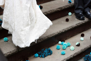
how about throwing pom poms at the bride on her wedding day? soft and fun!

via

fun and fluffy pom pom rug.

via

fun, flat pom pom pillows.
via

how about on your wedding veil? :)

via

every now and then i see decorations or accents to throws, pillows, curtains or now even my new favorite, furniture...with pom poms. pom poms make me smile. i love my martha stewart white summer pom pom bead spread. are any of you ever drawn to pom pom this or that?

to me they evoke celebration, parties, youth and flirting. they are accessories that move when the rest of your room is still, they add action to your curtains or flare to your pillows. so just for fun, here are some pom pom ideas. has anyone seen anything even more curious using pom poms? i'd love to know! enjoy...

Tuesday, April 21, 2009

pure, and green.


"pure is the vision and result of interior designer ami mckay who decided to create a line of furniture deserving of the environments where they reside. as a designer, mckay's goal is to discover and develop spaces people love to inhabit. with the unveiling of pure, mckay created a line of furniture that is as sustainable as it is elegant. mckay's dedication to sustainable product and spaces spans her designs, where she marries clean materials with elegant forms."

i am drawn to the very clean lines, color palettes and embroidery in the designing of pure's eco-furniture. such a simple chair or couch and then boom those lines of embroidery traveling around the piece, or up from the cushions or along the back. i'm starting to look at my plain ol' couch a little bit differently at the moment and picturing myself grabbing a needle and some beautiful thread. let me know your thoughts on pure's designs. i view them as fresh, alive, and pretty darn comfy looking! enjoy!

Monday, April 20, 2009

harmonie interieure.


i happened upon harmonie's site through apartment therapy, so thanks so much to them! i'm always drawn to unusual wall treatments and out of the ordinary text. i love harmonie's philosophy too...you have to visit their site and take a tour of their home, really fun. (the first picture up top is one of the photos of their wonderful home in the french countryside!)

"the workshop grew from our experiences decorating our own home. we want to use decorative stickers differently, we want to give them spirit... we want to use decorative stickers differently, we want to give them spirit ... passionate about typography, we create collections, not only to decorate and harmonise, but also to send a message about your home.... passionate about typography, we create collections, not only to decorate and harmonize, but also to send a message about your home .... your personal space. your personal space. we want to create a harmonie space, we create inside harmonie (“harmonie intérieure”). we want to create harmony in space, we create harmony inside."

be sure to hop on over to harmonie interieure on this monday for some great wall treatment ideas, it'll get your creative juices flowing. enjoy!

Friday, April 17, 2009

jorjah-tag.


one of my favorite bloggers jorjah-b tagged me with a question...if i could pick only one space that i could exist in, that inspires me, that evokes my style, my preferences and that i just plain love, what would it be. easier said than done...but oh so fun!

things i don't like in spaces. i don't like people who buy a house or build a house with a fireplace, and then don't use it. i would have to use it, just about every day. i don't like furniture that looks like you're not welcome. uptight and overstuffed. i don't like wall to wall carpet, i prefer natural wood with a rug here or there. the more bare the better. i don't like prints, i prefer hanging or displaying actual artwork or nothing at all. i don't like spaces where many things match. like lamps, dining chairs or even china in your cupboard. the more eclectic the better. i don't like everything in a home to be modern and new. it gives a sterile, cold environment. i prefer a mix of vintage and aged and gently worn mixed in with newer pieces. i prefer older homes over newer ones. i need splashes of color here and there but not overdone. i couldn't survive in spaces where everything was completely neutral. i don't like silk or imitation plants or flowers, they must be real or none at all. i don't like couches with no pillows, i have a pillow problem and need them around me :) besides all of that, i'm a happy camper!

there are so many great spaces and for so many moods and times of year, this is how i'm feeling at the moment anyway! i hope you enjoyed the space i selected and wonder if you would pick a similar space or something drastically different? hey, that's what makes this planet and the beautiful people in it so completely interesting and complex. i love that, and i love jorjah-b's blog. thanks to her for getting my creative juices flowing and always inspiring me. enjoy!

Thursday, April 16, 2009

beach it up dining.


coastal living has been giving me the fresh, outdoor-sy bug. they are featuring so many fabulous airy, beachy spaces, accessories, color palettes and intoxicating views of the outdoors. the warm outdoors that is. let me clarify since that's all i can think about at the moment. so grab a cup of coffee or tea, your favorite mag and settle into any one of these beachy dining nooks. my favorite out of these is photo number 1 where the chairs don't exactly match and i'm needing that oyster shell chandelier. where would you plunk down to enjoy your coffee? which of these spaces? enjoy!

Wednesday, April 15, 2009

spring and alkemie jewelry.


daily candy alerted me to the alkemie jewelry line and i'm so glad that they did. the alkemie line is the product of a husband and wife team, ashley lowengrub and dara gerson. the entire line is constructed from 100% reclaimed metals, pioneering one of the most environmental jewelry lines out there. their current "maiden voyage" line is the "inspired by organic themes and of the art nouveau movement and nature."

their pieces are chunky, weighty and yet evoke the lightness of spring and summer. a truly unique, individual and thoughtful jewelry line for this wednesday's deviation into the fashion world. jewelry design, like interior design has to be well thought out,instead of designing a space to dwell, jewelry designers must decide how does each piece sit on the human figure, how does it accent that person, does it fit their personality, do they feel comfortable wearing it? so many similarities to designing whether it be for us human beings to wear or for us to exist in. enjoy!

Tuesday, April 14, 2009

i'll take the stairs.

half and half? what about it? would it bother you to have your stairs half one color and half another? would it make going up and down the stairs an uneasy feeling or is it fun? via

red hot to trot. these solid red stairs pop against the snow white wall. the white planters help to break up the solid space and offer a buffer of color, toning the red down (a bit). could you paint your stairs lipstick red? hmmm. via
so these are what got my blood going. wow for some reason i love these stairs! think of the vast palette of mirrored glass you could put on the faces of each step instead of the traditional glass. could you add gold, or red, or blue. see what i mean? via
one, two, three here we go. i think this numbered concept is fun. like if you left something on the stairs you'd remember which number maybe? :) via
up close and personal with this tonal wallpapered staircase. love.
via

how clever to paint every part of each step except for the original stained center. you have the best of both worlds, painted and natural. via
this soft and sensuously shaped staircase has a interior frame of mirror. imagine the light hitting this staircase on a beautiful day. via
ummmmm. ? hot or not? i'm strangely attracted. via

this bright wallpaper addition spices up the typical stained brown stairs. i also want that grey door. via

i love the softness of these otherwise bright colors. does that make sense? i love that they have not used the typical rainbow consecutive colors here but added brown to mix things up. it definitely tones down the bright. via

wallpaper them! imagine the patterns and color palettes you could add. via

i love these "floating" stairs. sided with glass...it would be like walking to and from the clouds. via

i love the daring and unusual architectural design of these stairs. but if you were sleepy, in the middle of the night, would you trip and fall screaming? :) via

i wasn't intending on doing a post about stairs until...i saw them. the mirrored stairs. and my head went spinning. i thought, well if someone can mirror their stairs what else can they do?

with that said, i am a bit partial to painted stairs although those mirrored stairs have me contemplating the possibilities i have to tell you. enjoy, let me know your favorites or the ones that would bother you in your own home.