Pages
▼
Tuesday, August 31, 2010
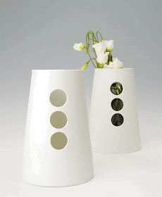
milky white porcelain.
with summer's~end looming, and all of the natural blooms surrounding us all slowly fading into the soon~to~come fall season, these exquisite milky white porcelain vases from jung~porzellan can show off those last minute blossoms and provide the perfect display for future floral arrangements. i fell in LOVE with these at first sight! if you have a restaurant or upscale bar, sprinkle these all over table~tops, along fabulous bars, on shelves, bed~side tables in hotels or straight to your own residential spaces. so grab those lingering last~minute blossoms around your home and consider jung~porzellan's vases to house them. enjoy...
Monday, August 30, 2010
monday night, late. hello if you're up.
(via)
it's late on monday night, almost tuesday. you can't see me in this image,(if this were really my bedroom, you might, but it's not) but i'm propped up, eating wheat thins and drinking a small glass of red wine right now. just back from all day in boston, classes started and a great day is behind me!
stood in line in boston, early in the morning, after getting up and driving even (way) earlier to get a parking garage pass (much coveted) in THE most (coveted) parking garage around campus, and (yeah that's right) i got it! (early bird gets the worm).
classes started at 5:30 p.m., so hung out near the airport watching the planes come in to land and take off again, dozing in the sun, eating grilled cheese sandwiches and french fries (only fattening if you eat them every day) ;)
off to classes where so far i love 2 out of my 3 professors (haven't met the 3rd one yet). so, to toast, i'm indulging in my wheat thins, on this bed (if it were mine) and drinking a small glass of delicious red wine before bed. (really, i am).
see you tomorrow for more fabulous design inspiration. i feel as if this year in particular, and in so many ways, design~wise and other~wise, is going to be exciting! good night! enjoy...
Friday, August 27, 2010
hello, it's friday!
yeah for this weekend! my very good friend from harvard is coming down to plunk on the beach, eat sandwiches and drink beer with me before the new semester starts. i'm soooooo excited to take her to my favorite beach, to boogie board, to laugh the day away and enjoy conversation, relaxing and unwinding towards this beautiful end of the summer.
my friend is sleeping over too, and while we have an extra bed for her, i stumbled upon this really fun, really fabulous design in sleeper sofas (which normally scream "hi, i'm a sleeper sofa and i'm not that attractive"). but this one designed by pietro arosio and via design within reach is a stand out sleeper sofa. it also has a removable sip cover! perfect for college students, those with less than sizable apartments (you know who you are!) or for an extra piece in a large children's room for friends' sleep~overs. genius.
enjoy your weekend friends. drink wine. eat only delicious food. rest. whoop it up. whatever you are desiring or needing from this end of the summer, grab it! enjoy....;)
Thursday, August 26, 2010
treat your walls.
kaynemalie seamless polycarbonate mesh. "inspired by new zealand's snow capped mountains and rivers", these mesh wall treatments could blend to a ceiling, especially in a fabulous commercial space. drape them, hang them, cluster them. really expceptional!
wall graphics and non~traditional wallpapers by berlintapete will give your walls, residential or commercial that extra pizazz, spice, conversation~ality that is needed. imagine the fire graphic blown up extra large behind a seating area in a lounge or above beds in a hot new hotel? a sizzling idea! ;)
i love these very thin, nola star wood panels. it's like creating a floating wall before your very eyes, offering up privacy without the solid~nature that a true wall would add to a space.
transform your bathroom, or any room, residential or commercial with mosaic tile from hisbalit. imagine a restaurant or bar? imagine the images you could use to transform those spaces? wow!
amazing wall panels by anne kyyro quinn. anne's approach to wall treatments is more of a 3~d approach than a traditional smooth surface. anne incorporates organic shapes with a scandinavian twist. really exceptional wall treatments, one of my true favorites!
creation baumann offers up these vivid, sun~shiney blinds. at first i was sort of like, "whoa, ah, not sure about these." but the more i looked, they really are fun! my mind went right to a kids room or playroom? perhaps perfect for a commercial space or store window? they really could be suited for all sorts of ideas, temporary or more permanent. just plain fun!
i couldn't help but notice some of these amazing new materials and textures in wall treatments, which by the way, can transform over to ceiling, windows, or who knows what? what i love about materials like any of these by these talented, inventive designers is that the possibilities are endless. like being handed a lump of clay or play~doh...you can create anything and everything, as far as mood, texture, color palette, completely transforming or setting the mood for any residential or commercial space. which did you like or love? what would you do with any of these? it's fun to imagine though right? enjoy!!!
Wednesday, August 25, 2010
colorful rooms.
with the 3rd day in a row of blustery, soaking rain and wind, i am in need of a burst of color. i found the boost i needed in these colorful rooms posted in bolig magasinet, which was welcome eye candy. i love what art can do to transform the mood of a space, especially by adding that punch of color here and there, to bring up a space. off to work, for now, hoping your mid~week wednesday is starting off with more sun than i have ;) enjoy...
Tuesday, August 24, 2010
space. "life uncompromised".
yesterday, on my book~shop hopping with my son, i had the luxury of perusing the fabulous pages of some pretty unique design mags. i located this fabulous site, space, based out of australia through one of them. have a look at some of my favorite inspirational goodies from space's chock~full design site!
space offers a dizzying amount of cutting~edge, conversation~piece, do~it~different~lighting. tons! like this "giga lite" by marc sadler for foscarini and for space.
and...one (of the many) suspension lights i found mesmerizing was this "5~pack" light by axel schmid for ingo maurer and for space. i love the accordion~esque nature to the light, keeping the light fluid, soft and unfolding right before your very eyes. just lovely!
this outdoor seating by b&b italia, and by patricia urquiola for space, provide an interesting amount of seating space, while fitting in with the outdoor environment, texture~wise, light~wise and throwing the outdoor space off a bit design~wise. these pieces are new outdoor favorites for me!
this super special "kartell" chair, called "pop", has fun written all over it. i love the busy nature of the fabric to the sub~dued spaces of the arms and legs, suspending the busy in mid~air! how completely amazing. perfect for any space in need of a true "pop" of color!
the industrial neutrality of this piece, "family life", is just plain ol' fascinating. really this piece could be put in any space, grand or other~wise, dressed~up or down, depending on the needs of the space it's inhabiting. really a great piece!
for these 2 pieces, the ovis & the ovis magnus, by leon krier, i was pulled in by the lines and also by the snow white color palette. in any space, they would be welcoming, sexy, pleasing and functional, all rolled up into one fabulous design ball.
i really love the modern, very edgy~ness to this piece, "living divani", by harry & camilla via space. adding in a piece like this, to an environment that perhaps is begging for a little excitement, this would certainly do the trick!
it was hard to even select a couple of coffee tables from space's website. there were soooo many fabulous materials, shapes, color palettes, to choose from, my head was spinning. you won't be disappointed if shopping around for a conversation~piece coffee table, whether for your residential or commercial spaces! remember...a coffee table can be such a focal point, a center meeting area, much like a kitchen table. even in a commercial space, you want to choose wisely, design~wise, when selecting a piece such as a coffee table.
space offers up an array of interesting rug choices as well, from grown~up to children's rooms.
the amount of options when designing either a residential or commercial space are limitless, as we see from just a tiny window into the offerings of space. remember to look outside of your area, sometimes going really outside your area, such as with sites such as space. and do you want to know why? because designing shouldn't always be easy. everything you need or imagine or want should not always be a hop, skip and a jump or jaunt away. sometimes you have to look high and low, near and far for the perfect lighting or wall treatment or single chair, that will make, complete or add to the space you are building. space is one of the many companies that offer you a plentiful amount of talented designers. space is worth considering, even if you are not from australia! enjoy....;)
space offers a dizzying amount of cutting~edge, conversation~piece, do~it~different~lighting. tons! like this "giga lite" by marc sadler for foscarini and for space.
and...one (of the many) suspension lights i found mesmerizing was this "5~pack" light by axel schmid for ingo maurer and for space. i love the accordion~esque nature to the light, keeping the light fluid, soft and unfolding right before your very eyes. just lovely!
this outdoor seating by b&b italia, and by patricia urquiola for space, provide an interesting amount of seating space, while fitting in with the outdoor environment, texture~wise, light~wise and throwing the outdoor space off a bit design~wise. these pieces are new outdoor favorites for me!
this super special "kartell" chair, called "pop", has fun written all over it. i love the busy nature of the fabric to the sub~dued spaces of the arms and legs, suspending the busy in mid~air! how completely amazing. perfect for any space in need of a true "pop" of color!
the industrial neutrality of this piece, "family life", is just plain ol' fascinating. really this piece could be put in any space, grand or other~wise, dressed~up or down, depending on the needs of the space it's inhabiting. really a great piece!
for these 2 pieces, the ovis & the ovis magnus, by leon krier, i was pulled in by the lines and also by the snow white color palette. in any space, they would be welcoming, sexy, pleasing and functional, all rolled up into one fabulous design ball.
i really love the modern, very edgy~ness to this piece, "living divani", by harry & camilla via space. adding in a piece like this, to an environment that perhaps is begging for a little excitement, this would certainly do the trick!
it was hard to even select a couple of coffee tables from space's website. there were soooo many fabulous materials, shapes, color palettes, to choose from, my head was spinning. you won't be disappointed if shopping around for a conversation~piece coffee table, whether for your residential or commercial spaces! remember...a coffee table can be such a focal point, a center meeting area, much like a kitchen table. even in a commercial space, you want to choose wisely, design~wise, when selecting a piece such as a coffee table.
space offers up an array of interesting rug choices as well, from grown~up to children's rooms.
the amount of options when designing either a residential or commercial space are limitless, as we see from just a tiny window into the offerings of space. remember to look outside of your area, sometimes going really outside your area, such as with sites such as space. and do you want to know why? because designing shouldn't always be easy. everything you need or imagine or want should not always be a hop, skip and a jump or jaunt away. sometimes you have to look high and low, near and far for the perfect lighting or wall treatment or single chair, that will make, complete or add to the space you are building. space is one of the many companies that offer you a plentiful amount of talented designers. space is worth considering, even if you are not from australia! enjoy....;)
Monday, August 23, 2010
rainy days and mondays. oh, & current favorites.
this wallpaper makes me happy. it's "lacework" by graham and brown, via burke decor. this wallpaper design comes in a variety of tones too! trouble is, which room to add it to? hmmmm.....
over the weekend, i roamed around my yard looking for colorful blooms to pick for an in~home, hand~picked arrangement. none to be found. end of summer nearing i suppose. so, instead, i went for an arrangement of greens and i am surrounded by gobs of brilliant, green ferns. so, now i desperately want a fern pillow or two, offered up from flutter. don't you? :)
i think this off~angled book case, designed by philippe nigro via nest, is super intriguing! how fun, filled with all of your favorite books, magazines and treasures ;)
in the sea of ho~hum phone covers, this woven vinyl fiber cover by chilewich is a refreshing choice. via relish.
how fabulous are these red heart coat hooks from rockett st. george? they are fun and flirty and again, remind us all to not take designing so seriously. we all need that!
with the busy summer surrounding me, i'm drawn to quiet spaces, like this wonderful leather lounge to stretch out and read, or cat nap! via rum magazine.
i just bought a necklace similar to this, except the colors were much lighter, pastels in fact. now i need this grey "twig" necklace from spool no. 72 for fall. seriously i do!
coveting these hand~tufted rose rugs from anna charlotte. i want a whole bouquet!
it's raining, obviously cloudy and grey on my day off today...but a good day to hit book stores, drink coffee in the afternoon (even if i don't need one, but just want one:), peruse through design mags & books to inspire new concepts and ideas. my son has the week off too, before school starts, so we are headed out together ;) enjoy your rainy or not~so~rainy~monday!
Tuesday, August 17, 2010
some simple design pleasures.
what are your design pleasures? is it a certain color palette? how about adding in pattern or texture? is your pleasure to fill a space, to warm it, cram it with all things you love? or is your pleasure to have clean, crisp spaces? i've posted some of my simple design pleasures, of all kinds really. a little of this, a little of that...
(via)
(via)
(next 3 via)
(via)
(via)
(via)
(via)
(via)
(via)
hoping this mid~week finds you happy, creative, somewhat relaxed (even if you are working :) and looking forward to friday. enjoy my simple design pleasure picks, i'd love to hear what yours are. do tell! enjoy...
(via)
(via)
(next 3 via)
(via)
(via)
(via)
(via)
(via)
(via)
hoping this mid~week finds you happy, creative, somewhat relaxed (even if you are working :) and looking forward to friday. enjoy my simple design pleasure picks, i'd love to hear what yours are. do tell! enjoy...