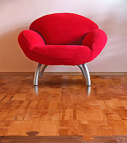
funk-a-delic flooring renovated by swedish architects tham & videgaard hansson. "the apartment is furnished with stark white furniture to keep the emphasis on the floors." ahh, i don't think you'd need the stark white furniture to notice the floors, they hightlight themselves just fine all alone :) but so fun...via.
apartment therapy featured the most unusual and (to me) stunning flooring i've seen in some time. "lars contzen's hard surface, high gloss floor panels are wall graphics taken down to the ground level. we first saw his blueprint lined linear landscape klick panels and thought we had died and gone to TRON heaven. but it's really the faux bois Woodlikewood line we love the most, a modern graphical interpretation of wood grain...." thanks for finding them apartment therapy!
from a fun site called frugal victoria, this floor is layed out on the cheap with different colored duct tape. ok, that's frugal. found here.
believe it or not this is hand painted. yes the floor is hand painted. yikes. ah...can you say talent? amazing! found here.
how about painting your floors white, then doodling them up? so fun for a children's room don't you think? found here.
how fun is this puzzle floor? especially in a children's room? found here.
good ol' fashioned black and white checkered floors. sometimes in the right space, these are perfect. found here.
both of these checkered floor designs found via apartment therapy.
i have an affinity for concrete, especially with flooring. i adore the simple yet strangely elegant affect it has when layed and either painted or decorated by adding a textural design such as these floors below. at my shop i left the floors concrete, painted them a chocolate brown and added gold glitter sprinkled all around then coated it with a clear concrete varnish. adds a bit of fun to the shop. and with concrete, there are so many options! found these here.
what are you up to on this gorgeous monday? feeling like fall around these parts but also invigorating. i start my classes tonight in boston and will keep plugging along towards my degree, which i love. taking some intriquing classes, one is the architecture of boston, including a walking tour of boston learning the different building styles, architects etc. getting to know my own city better. can't wait. enjoy your monday and enjoy these fun flooring ideas! it's such a creative world out there.
Pages
▼
Monday, August 31, 2009
Friday, August 28, 2009
fashion friday and collar fun.
wobashka's etsy site features hand made collar attire gently salvaged from vintage scarfs, giving them new life as necklaces. i love the element these add to an outfit, not only with color, but texture and composition if you will. if your body is a space, then these are a fun addition to that space for sure :)
lace felt collar by dadaya's etsy site.
also by dadaya's etsy site, this nautical themed lace felt collar made from wool and then embroidered. pretty pretty.
how about this shimmering red organza collar design? talk about making a statement. very fun. recycled from an "upcycled" tie, organza, buttons etc. and voila! find this and more here on e.w. mccall's etsy site.
this lovely collar art made from old stock black vintage venice lace stopped my heart. find it here at mary not martha's etsy site.
i love the fresh take on these collars with this crocheted scarflette look from eveldas neverland site on etsy.
as always, anthropologie offers their unusual versions of these collar creations. love the smoky grey colors, they'd accessorize anything.
currently i'm smitten with all of the pretty and oh so feminine collar fashion that is popping up just about everywhere. very vintage, very confident, very daring and very fun.
what about you? do you see yourself in any of these beauties? or would they be too much for you? i think with the right outfit, the right look, even a t-shirt and jeans in some cases, these would compliment and make for a stunning accessory.
what are you up to this weekend? we are supposed to get remnants of a storm off the coast here so sunny beach weather is most likely out. but...there is always taking in the ocean during a storm, i love witnessing the tides, the waves, the changes that a storm brings to that environment. that and maybe lobster bisque might make for a grand sunday. have fun wherever you are! enjoy :)
lace felt collar by dadaya's etsy site.
also by dadaya's etsy site, this nautical themed lace felt collar made from wool and then embroidered. pretty pretty.
how about this shimmering red organza collar design? talk about making a statement. very fun. recycled from an "upcycled" tie, organza, buttons etc. and voila! find this and more here on e.w. mccall's etsy site.
this lovely collar art made from old stock black vintage venice lace stopped my heart. find it here at mary not martha's etsy site.
i love the fresh take on these collars with this crocheted scarflette look from eveldas neverland site on etsy.
as always, anthropologie offers their unusual versions of these collar creations. love the smoky grey colors, they'd accessorize anything.
currently i'm smitten with all of the pretty and oh so feminine collar fashion that is popping up just about everywhere. very vintage, very confident, very daring and very fun.
what about you? do you see yourself in any of these beauties? or would they be too much for you? i think with the right outfit, the right look, even a t-shirt and jeans in some cases, these would compliment and make for a stunning accessory.
what are you up to this weekend? we are supposed to get remnants of a storm off the coast here so sunny beach weather is most likely out. but...there is always taking in the ocean during a storm, i love witnessing the tides, the waves, the changes that a storm brings to that environment. that and maybe lobster bisque might make for a grand sunday. have fun wherever you are! enjoy :)
Thursday, August 27, 2009
way outside the box. interior internet.
when i was coming up for the concept and design concept of my shop, i first conceived it as a mini coffee/wine bar serving nothing but pamper you products. not lunch, not dinner, just treats, from bread-fruit-cheese platters to fine chocolate, chocolate drinks, wines...well you get the concept right? when i did this thinking, and there was lots of it, my seating dreams always came back to interior internet's options. do you want to see why? here we go...
ok, so that's nothing. their site (interior internet) is completely full of the most amazing, definitely out of the box designs for the person who wants to remind people that there is more out there than meets the eye. always.
i toned down my shop to fine chocolate only to get started. we hold wine tastings to incorporate the wine with the chocolate but one day...i see this furniture in my commercial space, with you sipping on beautiful espresso, munching on cheeses imported from new york, france and italy. breads from the same and an atmosphere they'd have to drag you out of. isn't that what you want? :) i'd have to be dragged off of any of these pieces. you never know what the future holds, that's what's fun about it. enjoy!
Wednesday, August 26, 2009
moroso. unconventional seating options.
antibodi, designed by partricia urquiola is anything but a lounge chair, obviously. the design blossoms from a “cellular” genesis of petals sewn in triangular shapes, creating ample patterns. the lightly padded petals feature reversible materials – felt and wool fabric; wool fabric and leather – which create a supporting cover that is then fixed to a stainlesssteel metal frame. the cover creates two very different and striking moods: with the petals facing upwards for a more unconventional, feminine version; or facing downward for a deliberately severe, quilted look. the two sides are available in black and white, or a natural tone matched with a kaleidoscopic patchwork." serious lounge chair envy. :)
designer particia urquiola brings a new vision to your average pouffe. "the essential and light frame takes shape thanks to the use of new materials and new production technologies, while the visible stitching emphasises contemporaneity."
designer toshiyuki kita created "saruyama" out of molded flame retardant polyurethane foam. offering an organic, carefree form to support anybody, while the piece alone contributes an airy, dollup of furniture for your residential or commercial space.
the first thing that came to mind with this piece was a city skyline. any city really. designer ron arad created "do-lo-rez". "do-lo-rez is a very up-to-the-minute sofa composed of several soft, square-based cube- or rectangular-shaped units of various heights. the units are arranged in rows to form the shape of the sofa, and fixed to a platform by steel pins."
designer enrico franzolini depicts "boston" here in this stoic sofa, refined, serious and a perfect addition to an already busy space, offering calm and a breath.
designer marc newsom created gluon. i love the very "jetsons" quality the design offers. imagine this piece plunked right smack dab in the middle of a very non-contemporary space to throw the whole thing off, which is welcome sometimes.
here, designer tord boontje has created the "shadowy chair", evoking beach furniture found "at the north sea in northern europe in the twenties."
designer patricia urquiola has created a main range bohemian look for moroso. "patricia's family of products – sofa, bergère, chaise longue, armchair and pouf – have very fluid forms, almost as if they were melting over their frame, creating soft, irregular, enveloping, almost casual lines, where the fabric or leather is fixed to the shell with press-studs."
you know what's exciting? even if these designs are not for you, your taste or your commercial or residential space, the fact that we have such exciting designers on this creative planet of ours is what's most exciting. that they will constantly offer us a varied selection into the artistic, to push the boundaries, to change our focus sometimes for the better and for us to appreciate plain ol' design genius.
most of you know my style is really a mix of old and new. i absolutely and confidently feel that the two elements mix perfectly, appreciatingly and necessarily to fill spaces, capture spaces and to allow spaces to shine. so cheers today to the brilliantly talented minds in the design field. may they keep turning our heads...in very different directions. enjoy!
Tuesday, August 25, 2009
nightwood.
"nightwood is a brooklyn based home décor business specializing in its own reconstructed furniture and textiles. with a down to earth yet airy aesthetic and sensibility, nightwood conveys a modern rusticity that emphasizes hand crafted one-of-a-kind products. the two halves of nightwood are myriah scruggs and nadia yaron."
i was drawn to the simplicity of appearance of nightwood's pieces. then there is the repurposing of materials and discovering new, comfortable wares for your home or commercial space.
like puzzles, each of nightwood's pieces is carefully designed, put together not only to please the eye but the body. i love that nothing looks perfect. that each piece has a soul. a history. and a new beginning. we should all be so lucky :)
back from tennessee and all is right with the world. the best trip which was much needed. heading down from the smoky mountains we came upon a black bear sitting on the side of a windy road digging up the ground for grubs or bugs, not sure what. but what an amazing sight! i'll post pictures soon. simply breathtaking. enjoy!