peek-a-boo window on this not-so rectangular box with fun edges. perhaps a peek at the product would be the selling factor?
i was drawn to the flatness and width of this box and then those beveled edges. not your typical rectangular chocolate box. add a fancy label and voila.
i was smitten with the industrial-ness of this easy box. opening like a file folder. interesting concept with a nice stark logo. certainly makes you want to remove the elastic to investigate the contents.
then there's a company that will cover your boxes in handmade papers, leaving no two alike. i'd have to get the price on that but very creative and oh so pretty.
obviously not the graphic i'd be going for but what a punch this printing adds to a simple sturdy, and earthy kraft box. hmmm...
the simplicity here is elegant. a stamped or imprinted logo...that's it. is it too simple? but again, it's letting the chocolate speak for itself.
classic chocolate box, straightforward but...if you really blow the box away with a great label or sticker you could transform ordinary to extraordinary.
i was really taken with this one. as if you can push each chocolate piece right through the vellum or parchment paper to enjoy. i love the simplicity of the logo on the box as well. not overdone but captures your attention as to what's inside.
inventive shapes, handles and nice bright color grabs your attention.
the natural look of this box is intriguing and adding the paper closure label seals it up nicely.
these handy handles are cute. also the cube shape of the box is different too.
for the past few weeks we have been designing and constructing our new website for the shop. the website will consist of all "pieces" from numerous chocolatiers within this country and abroad. so...with the spanky new website we are creating, we also need to bump up our packaging a little bit without completely breaking the bank as packaging (at least the kind i like!) can be a fortune if you're not careful.
i found a great packaging site full of tons of inspiration called lovely package. i'm considering an earthy approach and going all natural think well made kraft boxes either with a great paper or vellum label or band around it or perhaps a creative stylish sticker. not sure yet. i'd love to have them printed but might be out of my budget. if i had them printed i would want them super subtle with perhaps an imprint of our logo in one color only. if packaging is crisp and stark it is more appealing in my opinion. it lets the product speak for itself. and if your product is fabulous as mine is, then the combination is perfect. let me know your thoughts on a fresh new box for us that you prefer...or do you know of any other great packaging pieces you've seen lately, if so forward me the info for sure :) enjoy!
Pages
▼
Thursday, April 30, 2009
Tuesday, April 28, 2009
a new take on the swing arm light.
via
via via
all above...via
via
via
i remember setting up my first drawing table and attaching that generic clip on, swing arm light to draw & create by. i always thought of them as awkward but yet a little bit cool. sort of a cross between interesting little robot creatures and cartoon characters. you'd almost wonder whether or not, if you had your head turned, would they just move on their own?
thinking about swing arm lights, i thought i'd offer a post of fabulous options to that clip on light on my first art table. swing arm lights that could blend in, accentuate and of course provide light to any area, not just a drafting table. they really can be a fun deviation from wall sconces, hanging lights and floor lights when considering your lighting options in either your commercial or residential space. they lend themselves to a bit of mobility, adjust ability and offer up that flexible, fun style. let me know your thoughts. would you want a swing arm light in any space of your own or one that you are planning for? enjoy!
Monday, April 27, 2009
cork.
how pretty are these cork basins?
with everyone and everything going 'green' i thought i'd investigate some 'green' furniture made with sustainable or found or recycled materials. cork came to mind. i wondered if there was any functional and atheistically pleasing and intriguing furniture being made with cork? and there is.
mind you, i wouldn't want an entire house full of cork but adding an element of this wonderful 'green' material to a space is definitely interesting. cork adds a dimension of light-weight texture, pattern, color, and pleasing feel to any space. it's warm, it's earthy and can be made into modern, hip pieces as we can see. cork eye candy for this sunny monday morning. enjoy!
Friday, April 24, 2009
urban fun.
i'm a bit of a knob-aholic. seriously i am. old and new. anthropologie also has some of the best knobs to choose from. sometimes i'll buy an older piece and change out the hardware on the piece to something more unusual and it's an instant face lift. but what a fun way to tie back curtains? loving it.
asian poppy curtain. color punch any room with these pretty curtains from urban.
honeycomb storage bins. imagine stacking them as high or low as you want? would make for an unusual design, displaying anything and everything.
pyramids of egypt pillows.
round picnic medallion rug. pretty gold and black.
grecian vase decal...another fun wall treatment.
white light wall clock. simple.
light up marquee letters from urban. fun to spell out just one word on a wall.
how fun to place this wire bird cutout over a simple bare bulb. imagine placing a group together and forming a flock of birds!
every now and then urban outfitters grabs my attention. the store has that punky flare that grabs us and throws us back to the 80's! so of course we might want to sneak a piece or two from their eclectic collection into one or more rooms in our house. it's for me a little pizazz, a reminder to not be so serious and that every piece in your home doesn't have to be so "grown-up". enjoy this sunny friday if you are in my neck of the woods. if not hopefully you are in the warmer temps like us! yeah! happy weekend everyone :)
Thursday, April 23, 2009
pretty patios.
if dining outside in the late afternoon or evening...set the mood. sprinkle twinkle lights everywhere, overhead, around, tabletop...anything goes with mood lighting. from martha stewart.
remember that there are so many pretty ways that don't take tons of time to display your outdoor goodies. mix your table up, serve your favorite edibles on anything from cake stands to china, to crystal. from martha stewart.
weighty earthy stonewear planters. sprinkle them around the patio in different sizes, different heights. fill them with bright flowers for patio punch. from at west end.
hang these everywhere! wonderfully natural rattan lanterns from at west end.
floor your guests with unusual outdoor lighting choices. from 0900 design.
these flexible vibrant lights can go from indoor to out. wrap them around a branch, spotlight your outdoor dining table, or your pool. from 0900 design.
make a stand...full of flowers that is. from wisteria.
go for different with a modern planter. how perfect would this match up with a gorgeous, tall topiary? from velocity.
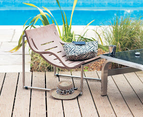
remember that there are many versions of a lounge chair...how about this for your not-so-typical? from horchow.
another new take on the lounger, from umbra.
plunk in some color with this vibrant blue bench from horchow.
wonderfully soft tericloth slip covers for your lounge chairs. from west elm.
as we head into a warm front in new england we are all itchy to be outside, in any way shape or form. eating, sitting, drinking, playing you name it. i thought i'd find a few pretty patio ideas for when you are partaking of the fresh air and outdoor space around your home or yard.
if dining en plain air...remember the little touches, fresh flowers, display foods on cake stands or flowery platters, gobs of candlelight, party lights to add twinkle to your get together. so many easy touches can make it look as if you've spent hours preparing that space.
create a patio oasis, in whatever style or color palette suits your individual taste. do you like it bright? subdued? eclectic? make it your own. what fun ideas do you have for dressing up a patio space or for making a fun outdoor meal even more special? i'd love to hear. enjoy!
remember that there are so many pretty ways that don't take tons of time to display your outdoor goodies. mix your table up, serve your favorite edibles on anything from cake stands to china, to crystal. from martha stewart.
weighty earthy stonewear planters. sprinkle them around the patio in different sizes, different heights. fill them with bright flowers for patio punch. from at west end.
hang these everywhere! wonderfully natural rattan lanterns from at west end.
floor your guests with unusual outdoor lighting choices. from 0900 design.
these flexible vibrant lights can go from indoor to out. wrap them around a branch, spotlight your outdoor dining table, or your pool. from 0900 design.
make a stand...full of flowers that is. from wisteria.
go for different with a modern planter. how perfect would this match up with a gorgeous, tall topiary? from velocity.
remember that there are many versions of a lounge chair...how about this for your not-so-typical? from horchow.
another new take on the lounger, from umbra.
plunk in some color with this vibrant blue bench from horchow.
wonderfully soft tericloth slip covers for your lounge chairs. from west elm.
as we head into a warm front in new england we are all itchy to be outside, in any way shape or form. eating, sitting, drinking, playing you name it. i thought i'd find a few pretty patio ideas for when you are partaking of the fresh air and outdoor space around your home or yard.
if dining en plain air...remember the little touches, fresh flowers, display foods on cake stands or flowery platters, gobs of candlelight, party lights to add twinkle to your get together. so many easy touches can make it look as if you've spent hours preparing that space.
create a patio oasis, in whatever style or color palette suits your individual taste. do you like it bright? subdued? eclectic? make it your own. what fun ideas do you have for dressing up a patio space or for making a fun outdoor meal even more special? i'd love to hear. enjoy!