Pages

Wednesday, December 31, 2008

stray dog designs and happy new year!

what's fun about stray dog's designs is that you can order any of these things below in a number of color choices. i picked all white because it's snowing like crazy out here today and it matched my mood and the snow! :) so imagine the possibilities!


stumbled upon stray dog designs and wanted to share their neat story and products. certainly a fun, eclectic little company but with a great tale and beginnings. "bill and jane were newlyweds. after a marriage so hasty it could have been part of a reality television show, they fled to mexico to "get to know one another."
stray dog story "the export business was a start but soon they realized that jane's talent for design coupled with bill's boundless energy was propelling them toward creating something uniquely their own. with la princessa (their own real life stray dog!) always by their side, panting with quiet encouragement, they explored several options until they discovered guadalupe alvarez's tin workshop." "picking up on jane's creative eye and desire for design that was altogether different, guadalupe told her, "draw something." jane scrawled a kooky lamp on a napkin and a few days later the first stray dog creation was born." "over a decade later, stray dog designs' core design principles are simple: all items are handmade with careful construction from quality and recycled materials, melding quirky charm and true artistry, and providing fair wages for local workers."


happy happy healthy new year everyone! prosperous, generous, exciting, stimulating, loving, intriguing, sensational, indulgent, and so much more are my wishes for everyone's new year to come! my thankful list is coming soon but for now, enjoy your evening, each other and blogland...see you next year!

Tuesday, December 30, 2008

neutral palettes.

"layering textures throughout a room, hints of metallics, for example, or a luxurious sheepskin rug, keeps neutrals from looking bland."
photo by simon upton

photo by justin bernhaut

here adding and accent of red from flowers which can also be replaced easily gives you many options. i also love the simplicity of this room right up to the dainty small chandelier over the bed.
photo by james merrell

photo by miguel flores-vianna

"the subtle spot of worn brick adds intrigue to an all white palette."
photo by max kim-bee.

this bedroom, talk about peaceful.
photo by mikkel vang.


photo by matt albiani

another thing i like about this room is the way everything appears to be teetering on a point, from the coffee table to the couch legs to the side table, kind of a pointy consistent feel.
photo by anita calero


photo by justin bernhaut


photo by max kim-bee


lately i'm seeing so many fabulous rooms and spaces painted in subtle neutral hues. sand and sky palettes and i love this. one would never tire of these natural tones and feels. of course adding that splash of red or purple in an intriguing or vintage chandelier or chair or pillow accents would complete and balance all of that neutrality! easier to change out things like pillows than to keep painting a wall because that bright color is starting to grate on you. domino magazine features an array of stately, comfortable and neutral toned spaces and i thought i'd share the feel of little color. it's calming, relaxing, open and spacious, no matter the size of the space. so breathe and enjoy these gorgeous neutral spaces while at the same time think of what you might add to spice it up. what color in what space? flowers or a piece of furniture that is bold like a red? so many options if you start out with this blank, neutral canvas.

Monday, December 29, 2008

mitab


mitab, a swedish company boasts of a friendly environmental relationship with the planet as well as beautifully designed, clean lined furniture. furniture you can breathe on or in. in 1979 mitab began manufacturing furniture for the home market then branched out to the contract market. situated on lake sommen, "a region with long traditions in furniture making", mitab is lead today by the 2nd generation torstensson family, lucky for us. their environmental ingredients page on their website is fabulous, stating that mitab uses only beech and birch from near by finland and germany using no tropical woods. steel tubes and other metal parts are produced from strip steel and are fully recyclable. i love reporting about companies using nothing but either recycled parts, parts that can easily be recycled or break down and that are building awareness and consciousness for what we take and what we leave in our tracks, even our furniture tracks! just great. enjoy your swedish eye candy for this sunny monday!

Wednesday, December 24, 2008

sugar snap.


a friend of mine stopped by my shop today and told me about another local blogger yummy goods. melissa averinos has a fun blog and has also begun her own line of fabric which i wanted to share with all of you. "unexpected and exuberant designs in brights and pastels." free spirit is featuring melissa's fabrics as well as those by other artists. her line is vibrant, eclectic, energetic and seriously fun. for quirky, elegant and yummy gifts and such, visit her blog which represents her store here on cape cod massachusetts and to head directly to her fabric line on free spirit click here. support small businesses especially those created by extremely talented and fun individuals! it's a grey day here on cape cod and hopefully if it's grey where you are...this beautiful line of fabric has brightened your day. :)

i'd like to lastly say happy holidays to everyone in blogland and safe travels! looking forward to a new year coming up full of promise, excitement and prosperity. i'll see everyone right back here after christmas......bye for now!

Monday, December 22, 2008

gus.


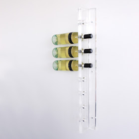
acrylic wine rack, very fun.


fabulous storage cabinet for an accompaniment to the gus couch.


stick light from gus. stainless steel channel, leans against the wall for subtle ambient light, and operates with a foot switch.

great bare bones, no nonsense light. perfect in the perfect space.


gus design group is out of ontario canada. elegant, clean lines, bare bones design but full of thought. "we are inspired by simple forms and honest materials. we use them as the springboard for everything we create. from the simple two by four and construction i-beam to the useful miter box, we delight in the simplicity of everyday objects. the result is furniture, accent pieces, and accessories that mix the elegant with the industrial. mirroring the great day modernists of yesterday, we strive to combine great design and practical purpose." fabulously refreshing i think anyway! love it. what are your thoughts? i think you are either drawn to these simple lines or your not. it's as simple as that...get it?! happy monday mornin' :)

Thursday, December 18, 2008

thomas paul.


sorry for the lack of fun posts, been good crazy busy at the shop, leading up to christmas is usually a bit nutty here, but fun fun! while checking out velocity's website i came across beautiful rugs by thomas paul, and pillows too! for you pillow addicts, like myself. bold, clean lines and fat shapes fill up the size of his rugs with prints of birds, flowers and some are a bit abstract which is always fun too. bold designs infused with striking colors, perfect. "these cotton pillows will surely add oomph to any room." well said from velocity! "thomas' concept is simple: mix unrelated historic design styles - art nouveu, 60's pop art, 70's minimalism, 18th century baroque, and reinterpret these disparate periods into a unique style with a coordinated color palette that works with today's interiors."
thomas paul offers high quality at a great price point, the best of both worlds. take a hop, skip and a jump over to velocity and ogle his rugs and pillows like i did. enjoy!